Questions that will help you avoid Unrewarding Work

1. Do you have data?
2. Who will I report to?
3. How will my performance be measured?
4. How many other data professionals will there be?
5. Have the data been analysed before?

Great post from DC data community: http://datacommunitydc.org/blog/2013/07/the-top-n-questions-every-budding-data-scientist-should-ask-during-a-job-interview/?utm_source=rss&utm_medium=rss&utm_campaign=the-top-n-questions-every-budding-data-scientist-should-ask-during-a-job-interview

Choosing a data science technology stack [w/ survey]

tl;dr: Choosing the right technology stack can mean the difference between SUCCESS and FAILURE in data science. It can also mean the difference between ‘I Feel Productive’ and ‘Everything I try takes so much time’. When deciding which toolkit / stack be sure to learn from others, consider implementation partners, and always remain cautious. 

Note: In addition to this post, I am surveying people to determine which data science technology stacks are being used right now. The survey responses will remain confidential and can be accessed via this link: http://bit.ly/ToolkitSurvey (takes less than 200 seconds!). Those that complete the survey will get a copy of the report (which will detail the pros/cons of popular data science technology stacks).

Continue reading

How to quickly evaluate a data science project

This context is that I’ve got a short time to evaluate the quality of a data science project recently completed. This project has generated an insight that tells us something about our business. From my evaluation , I need to decide whether the business should act upon the insights generated. Acting upon insights will cost time and money. If the initiative fails, which is healthy and happens often, I’m going to need to both justify my actions and learn from the failure. To do this, I need to make sure  to act only upon quality analyses. Repeatedly doing this requires me to learn how to sniff out the good and bad projects quickly.

If I need to quickly evaluate the quality of a data science project, I try answer three simple questions:

  1. Data Understanding:  Has the underlying data supporting the output been correctly understood?
  2. Insight Value: Are the insights generated valuable to the business?
  3. Execution: Was the technical execution of the initiative robust?

In my experience, A high-quality data scientist will answer these questions as an output to the project. For a new data scientist (or one without business context), asking questions allows me to quickly reach a conclusion on each.

If you want to be an excellent data scientist, ensuring you nail each of the above the above should be the compass that directs your efforts.

Should you Act?

I usually try answer some or all of these questions to reach a conclusion. Feel free to suggest ones I’ve missed in the comments below.

Data Understanding

  • Has the data quality been assessed? What did this exercise look like? Where there any significant concerns?
  • For data that is manually captured by (at some stage) by humans, has this been accounted for? How?
  • Is the data history clear? Has this data been through multiple legacy system migrations? Has the impact of this been determined? How was this dealt with?
  • How have missing or null values been addressed? What proportion of such values were there?
  • Is the organisation’s data capture process clear? Were there any data items (having looked at the data capture process) that didn’t match their definitions?

Insight Value

  • Is the insight actionable (can I act upon this insight)? Are there any legal, regulatory, logistical or other challenges that would prevent me from acting upon this insight?
  • Is the insight valuable? If this insight is correct, and take action based upon it, will those actions lead to better outcomes (e.g. profits, subscribers, success) for the organisation?
  • Is the insight testable? Is it possible to verify the conclusions of the project? If not, does this present a major problem?
  • Will acting on the insights be cost-effective relative to the potential gains?
  • Are there any major risks to acting upon this insight? Will I be opening a Pandora’s box (e.g.significantly changing our relationship with customers)? How do these risks stack up against the potential benefits?

Execution

  • Has the code quality been tested?
  • Is the statistical model / implementation based on reliable assumptions (e.g. homogeneity of time series patterns),
  • Have the model outputs been tested independently of the model (e.g. train/test)? 
  • Good data governance throughout the project (so nothing got inadvertently messed up)?
  • Are the significant data and business assumptions documented?
  • Was testing designed and preformed independent of the project delivery?
  • What statistical methods were tried and rejected? Why were these rejected?


Model accuracy is less important than you think

The scenario is this: You are a data scientist supporting a marketing manager in preventing customers from switching to your competitor. She is quite savvy and has a reliable technique, which costs some amount per use, that is excellent at convincing customers not to switch e.g. an unexpected discount on their bill. She needs your expertise is in identifying a list of customers she should apply this technique to.  A good list she tells you, should pick only customers that result in an outcome that increases profit (revenues less expenditure) for your company.

Clearly the objective is to best split the list into 2 groups (‘high-switch-risk’ and ‘not-high-switch-risk’) given the underlying uncertainty  But here’s the rub: the size of the high-switch-risk group has not been specified. It would easy to generate a list with a really high certainty about which customers are actually high-switch-risk.  However, this list would probably only number a handful of customers, as to increase the accuracy we’d only include customers we are really really certain about. This list would likely miss out on many high-switch-risk customers.

Therefore, we need to increase the size of the list, and hence reduce the accuracy . In order to determine when to stop increasing the size, and remembering that the objective is to maximise profits, we often ask ourselves the following questions:

  • False Positive Cost: What is the cost of incorrectly identifying a customer as high risk of switching (i.e. wasted marketing cost)?
  • False Negative Cost: What is the cost of failing to identify a high-risk customer (i.e. lost revenue)?
  • How many False Positive Costs = A False Negative Cost?

Ask yourself these questions when score a model for quality. Remember that depending the on context, sometimes having less false positives is more important than overall accuracy and sometime having less false negatives is more important.

The ability to execute upon an insight (=’Actionability’) is nearly always the most important metric to judge model success. Models exist to help us create more desirable outcomes; therefore models are scored on their ability to enable us to create more desirable outcomesThe objective is to maximise profitability, under this perspective some insights are more valuable than others.

I’ve summarised below a number of stylized scenarios to illustrate the concept. In a future post, I plan to dive into this is more detail – including implementing a predictive solution in R (if you have any good multivariate datasets I could use for this, please do point them towards me).

Case A
Fraud Investigation (limited number of investigations)
An investigation by an IRS or HMRS agent costs a lot – wrong predictions are expensive!
– False Positive is very expensive
– False Negative is inexpensive
– List should have few customers, and be really accurate

Case B
Mail Package Identification
Opening a package doesn’t take much time, letting €mm worth of contraband into a country is not good!
– False Positive is inexpensive
– False Negative is expensive
– List should have many customers, and hence less accurate

Case C
Churn Prediction, where intervention is inexpensive (e.g. ‘cinema tickets’) and losing customers is expensive
– False Positive is inexpensive
– False Negative is expensive
– List should have many customers, and hence less accurate

Case D
Churn Prediction, where intervention is expensive (e.g. ‘big discount on bill’) and losing customers is expensive
– False Positive is expensive
– False Negative is expensive
– List should be midsized, with reasonable accuracy and reasonable number of false negatives

False Positive / False Negative

Create Rich Interactive Visualisations

How to use dc.js to quickly (and easily!) create visually impactful interactive visualisations of data. In an afternoon. Something like this interactive visualisation.

Often it is desirable to create a visualisation of a dataset to enable interactive exploration or share an overview of the data with team members.

Good visualisations help in generating hypothesis about the data which can be tested / validated through further analyses.

Desirable features of a such a visualisation include: accessible via browser (anyone can access it!), interactive (supports discovery), scalable (a solution suits datasets of multiple sizes), easy / quick to Implement (good as a prototype development tool), and flexible (custom styling can emphasis important features).

The process for creating an exploratory visualisation usually looks like this:

  1. Explore Data & Data Features
  2. Brainstorm Features / Hypothesis about patterns
  3. Roughly Sketch Visual
  4. Iteratively Implement Visualisation
  5. Observe Users interacting
  6. Refine, Test, Release

When first working with a dataset, understanding how it will be useful is a primary objective. Rapidly iterating through the process outlined above can help us understand it’s usefulness very quickly. Access to the right tools can help us in rapidly iterating through this process.

That is where Dimensional Charting (dc.js) comes in. dc.js is a neat little javascript library that leverages both the  visualisation power of Data Driven Documents (d3.js) and the interactive / coordination of Crossfilter (crossfilter.js).

dc.js is an open source, extremely easy-to-pick-up javascript library which allows us to implement neat custom visualisations in a matter of hours.

This post will walk through the process (from start to finish) to create a data visualisation. Today, the emphasis is to very quickly arrive at an opinionated visualisation of our data that enables us to explore / test specific hypothesis. In order illustrate this concept, we will use a simple dataset taken from the yelp prediction challenge on Kaggle. Specificlly we will be using the file yelp_test_set_business.json.

(Step 1) Explore Data & Data Features

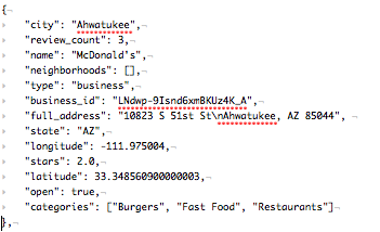
The data we’ve chosen for this visualisation is json, has one object per business and each object is structured according the the following example:

Image

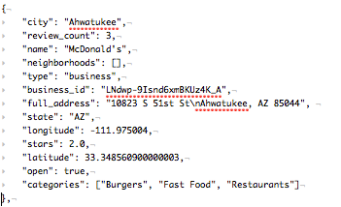
The full dataset contains approximately 1,200 business, all located in Arizona. Let’s assume we are interested in exploring the difference between cities, for example, the review count and average ranking by business per city. The features important for this will be (1) City, (2) Review Count, (3) Stars (Rating), (4) Location and (5) Business ID.


(Step 2) Brainstorm Features / Hypothesis about patterns

Quick Brainstorm (of desirable hypothesis or questions):

  • Which cities have a high number of businesses than others?
  • Do specific cities have higher rated businesses than others?
  • Do certain cities have a higher average number of reviews per business?
  • Are their cities with very low number of reviews?
  • What proportion of businesses in a city are 1-star compared to 5-star?
  • List the highest / lowest rated business for a specific city (for anecdotal exploration)

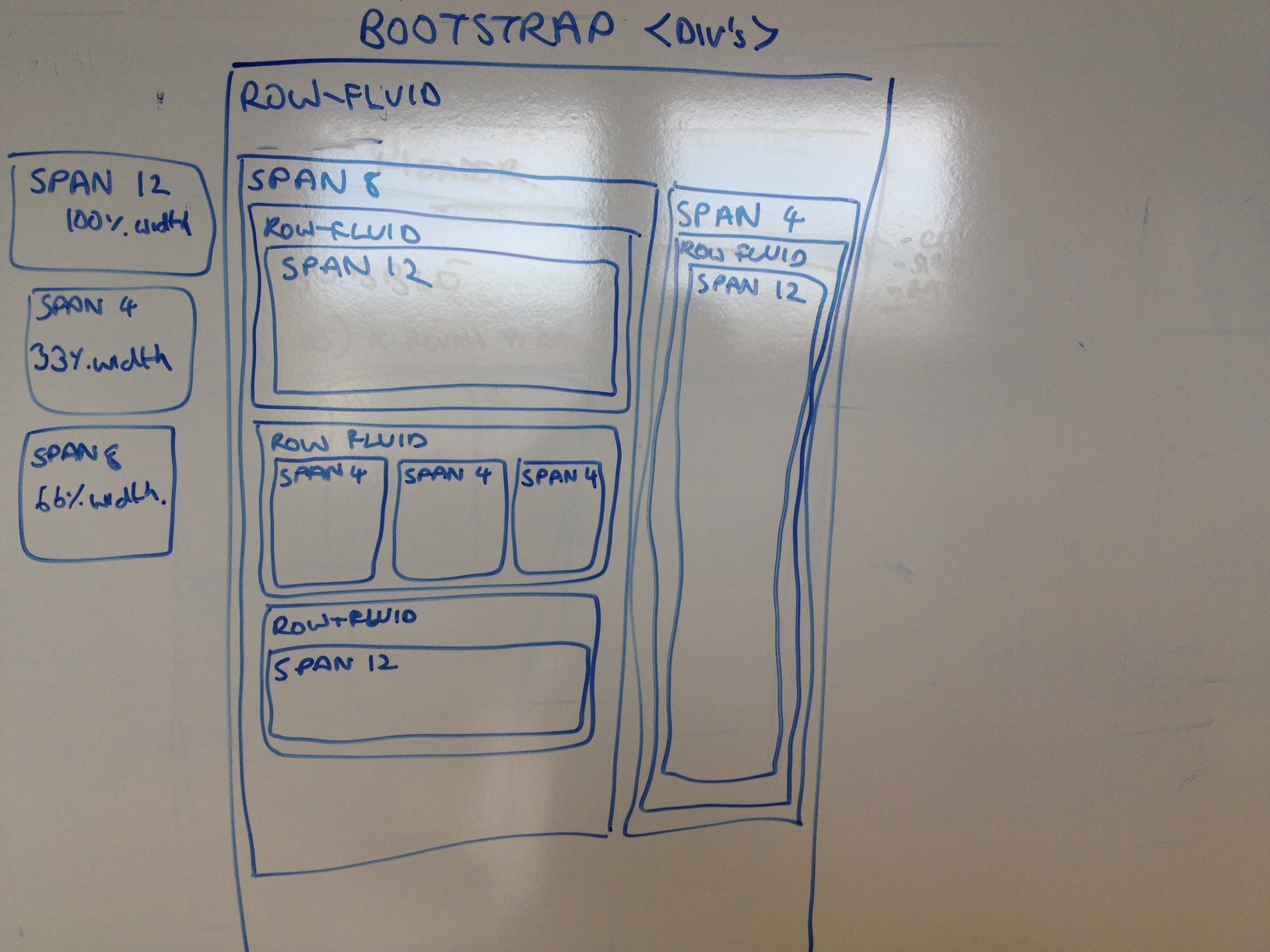
(Step 3) Roughly Sketch Visual

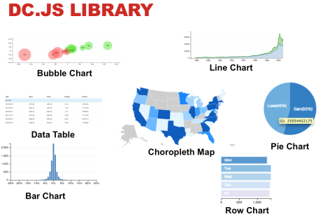
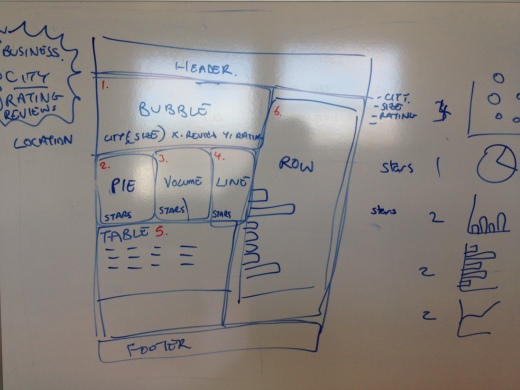
Based on the above, it seems like a grouping comparison by city, with a drilldown into specific features (rating, number of reviews, list of specific businesses would be useful). So our visualisation will have to hit all these objectives. Within dc.js, we have the option of the following charts.

Image

 After a little whiteboard brainstorming, we arrive at something that looks like the below. The numbers (marked in red) refer to the following visualisations (note a secondary objective here was to use many visualisations):

  1. Bubble chart (bubble = city, bubble size = number of businesses, x-axis = avg. review per business, y-axis = average stars)
  2. Pie Chart (% of businesses with each star count)
  3. Volume Chart / Histogram (average rating in stars / # of businesses)
  4. Line Chart (average rating in stars / # of businesses)
  5. Data Table (business name, city, reviews, stars, location – link to map)
  6. Row Chart (# reviews per city)

Image


(Step 4) Iteratively Implement Visualisation

This next step is iterative. This is the process by which we implement our rough sketch into our visualisation. This is achieved through a three step process.

Image

Implementing our visualisation (Step 1) – Development Environment Setup

  1. In a new folder create index.html (with “Hello World” inside) , simple_vis.js
  2. Copy yelp data & components* (js/css) into subfolders (“data” (.json), “javascripts” (.js), stylesheets (.css)
  3. Start web server (mongoose.exe) from folder (or “python -m htttp.server”  if on mac)
  4. Open browser to url localhost:8080 (test that it is working)
  5. Open javascript console
* The components we will need are jQuery, d3.js, crossfilter.js, dc.js, dc.css, boostrap.css, bootstrap.css (these are all located in the resources zip file).
Implementing our visualisation (Step 2) – HTML Coding
First we’ll have to load the appropriate components (outlined above). The beginning of the html should look like this:
<!DOCTYPE html>
<html lang='en'>
<head>
<meta charset='utf-8'>

<script src='javascripts/d3.js' type='text/javascript'></script>
<script src='javascripts/crossfilter.js' type='text/javascript'></script>
<script src='javascripts/dc.js' type='text/javascript'></script>
<script src='javascripts/jquery-1.9.1.min.js' type='text/javascript'></script>
<script src='javascripts/bootstrap.min.js' type='text/javascript'></script>

<link href='stylesheets/bootstrap.min.css' rel='stylesheet' type='text/css'>
<link href='stylesheets/dc.css' rel='stylesheet' type='text/css'>

<script src='simple_vis.js' type='text/javascript'></script>
</head>
Secondly, as we are using bootstrap layout we’ll want to sketch out the div’s we’ll use (for more on this, we bootstrap scaffolding).
Image

When we’ve translated this layout to html, it looks like the. Each div in the code below refers to a box in the diagram above (and nested div’s are boxes within a box – it’s that simple!).  Also note that we have given each of our span div’s an id attribute to indicate the visualisation that will go into it (e.g. line 12 <div class=’bubble-graph span12′ id=’dc-bubble-graph’>. The reason for doing this will become apparent when we look at the javascript later.

<body>
	<div class='container' id='main-container'>
		<div class='content'>
			<div class='container' style='font: 10px sans-serif;'>
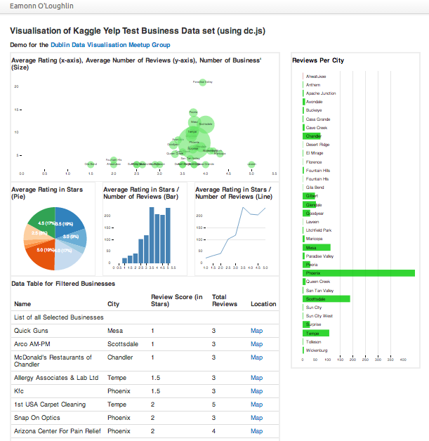
				<h3>Visualisation of <a href="http://www.kaggle.com/c/yelp-recruiting">Kaggle Yelp Test Business Data</a> set (using <a href="http://nickqizhu.github.io/dc.js/">dc.js</a>)</h3>
				<h4>Demo for the <a href="http://www.meetup.com/Dublin-Data-Visualisation/">Dublin Data Visualisation Meetup Group</a></h4>
				<div class='row-fluid'>
					<div class='remaining-graphs span8'>
						<div class='row-fluid'>
							<div class='bubble-graph span12' id='dc-bubble-graph'>
								<h4>Average Rating (x-axis), Average Number of Reviews (y-axis), Number of Business' (Size)</h4>
							</div>
						</div>
						<div class='row-fluid'>
							<div class='pie-graph span4' id='dc-pie-graph'>
								<h4>Average Rating in Stars (Pie)</h4>
							</div>
							<div class='pie-graph span4' id='dc-volume-chart'>
								<h4>Average Rating in Stars / Number of Reviews (Bar)</h4>
							</div>
							<div class='pie-graph span4' id='dc-line-chart'>
								<h4>Average Rating in Stars / Number of Reviews (Line)</h4>
							</div>
						</div>
						<!-- /other little graphs go here -->
						<div class='row-fluid'>
							<div class='span12 table-graph'>
								<h4>Data Table for Filtered Businesses</h4>
								<table class='table table-hover dc-data-table' id='dc-table-graph'>
									<thead>
										<tr class='header'>
											<th>Name</th>
											<th>City</th>
											<th>Review Score (in Stars)</th>
											<th>Total Reviews</th>
											<th>Location</th>
										</tr>
									</thead>
								</table>
							</div>
						</div>
					</div>
					<div class='remaining-graphs span4'>
						<div class='row-fluid'>
							<div class='row-graph span12' id='dc-row-graph' style='color:black;'>
								<h4>Reviews Per City</h4>
							</div>
						</div>
					</div>
				</div>
			</div>

		</div>
	</div>
</body>
</html>

Implementing our visualisation (Step 3) – Javascript Coding

Perhaps the most difficult part to grasp, the JavaScript coding is completed according to the following steps:

  1. Load Data
  2. Create Chart Object(s)
  3. Run Data Through Crossfilter
  4. Create Data Dimensions & Groups
  5. Implement Charts
  6. Render Charts

The code for this is clearly commented below.

/********************************************************
*														*
* 	dj.js example using Yelp Kaggle Test Dataset		*
* 	Eol 9th May 2013 						*
*														*
********************************************************/

/********************************************************
*														*
* 	Step0: Load data from json file						*
*														*
********************************************************/
d3.json("data/yelp_test_set_business.json", function (yelp_data) {
	
/********************************************************
*														*
* 	Step1: Create the dc.js chart objects & ling to div	*
*														*
********************************************************/
var bubbleChart = dc.bubbleChart("#dc-bubble-graph");
var pieChart = dc.pieChart("#dc-pie-graph");
var volumeChart = dc.barChart("#dc-volume-chart");
var lineChart = dc.lineChart("#dc-line-chart");
var dataTable = dc.dataTable("#dc-table-graph");
var rowChart = dc.rowChart("#dc-row-graph");

/********************************************************
*														*
* 	Step2:	Run data through crossfilter				*
*														*
********************************************************/
var ndx = crossfilter(yelp_data);
	
/********************************************************
*														*
* 	Step3: 	Create Dimension that we'll need			*
*														*
********************************************************/

	// for volumechart
	var cityDimension = ndx.dimension(function (d) { return d.city; });
	var cityGroup = cityDimension.group();
	var cityDimensionGroup = cityDimension.group().reduce(
		//add
		function(p,v){
			++p.count;
			p.review_sum += v.review_count;
			p.star_sum += v.stars;
			p.review_avg = p.review_sum / p.count;
			p.star_avg = p.star_sum / p.count;
			return p;
		},
		//remove
		function(p,v){
			--p.count;
			p.review_sum -= v.review_count;
			p.star_sum -= v.stars;
			p.review_avg = p.review_sum / p.count;
			p.star_avg = p.star_sum / p.count;
			return p;
		},
		//init
		function(p,v){
			return {count:0, review_sum: 0, star_sum: 0, review_avg: 0, star_avg: 0};
		}
	);

	// for pieChart
    var startValue = ndx.dimension(function (d) {
		return d.stars*1.0;
    });
    var startValueGroup = startValue.group();

	// For datatable
	var businessDimension = ndx.dimension(function (d) { return d.business_id; });
/********************************************************
*														*
* 	Step4: Create the Visualisations					*
*														*
********************************************************/
	
 bubbleChart.width(650)
			.height(300)
			.dimension(cityDimension)
			.group(cityDimensionGroup)
			.transitionDuration(1500)
			.colors(["#a60000","#ff0000", "#ff4040","#ff7373","#67e667","#39e639","#00cc00"])
			.colorDomain([-12000, 12000])
		
			.x(d3.scale.linear().domain([0, 5.5]))
			.y(d3.scale.linear().domain([0, 5.5]))
			.r(d3.scale.linear().domain([0, 2500]))
			.keyAccessor(function (p) {
				return p.value.star_avg;
			})
			.valueAccessor(function (p) {
				return p.value.review_avg;
			})
			.radiusValueAccessor(function (p) {
				return p.value.count;
			})
			.transitionDuration(1500)
			.elasticY(true)
			.yAxisPadding(1)
			.xAxisPadding(1)
			.label(function (p) {
				return p.key;
				})
			.renderLabel(true)
			.renderlet(function (chart) {
		        rowChart.filter(chart.filter());
		    })
		    .on("postRedraw", function (chart) {
		        dc.events.trigger(function () {
		            rowChart.filter(chart.filter());
		        });
			            });
		    ;


pieChart.width(200)
		.height(200)
		.transitionDuration(1500)
		.dimension(startValue)
		.group(startValueGroup)
		.radius(90)
		.minAngleForLabel(0)
		.label(function(d) { return d.data.key; })
		.on("filtered", function (chart) {
			dc.events.trigger(function () {
				if(chart.filter()) {
					console.log(chart.filter());
					volumeChart.filter([chart.filter()-.25,chart.filter()-(-0.25)]);
					}
				else volumeChart.filterAll();
			});
		});

volumeChart.width(230)
            .height(200)
            .dimension(startValue)
            .group(startValueGroup)
			.transitionDuration(1500)
            .centerBar(true)	
			.gap(17)
            .x(d3.scale.linear().domain([0.5, 5.5]))
			.elasticY(true)
			.on("filtered", function (chart) {
				dc.events.trigger(function () {
					if(chart.filter()) {
						console.log(chart.filter());
						lineChart.filter(chart.filter());
						}
					else
					{lineChart.filterAll()}
				});
			})
			.xAxis().tickFormat(function(v) {return v;});	

console.log(startValueGroup.top(1)[0].value);

lineChart.width(230)
		.height(200)
		.dimension(startValue)
		.group(startValueGroup)
		.x(d3.scale.linear().domain([0.5, 5.5]))
		.valueAccessor(function(d) {
			return d.value;
			})
			.renderHorizontalGridLines(true)
			.elasticY(true)
			.xAxis().tickFormat(function(v) {return v;});	;

rowChart.width(340)
			.height(850)
			.dimension(cityDimension)
			.group(cityGroup)
			.renderLabel(true)
			.colors(["#a60000","#ff0000", "#ff4040","#ff7373","#67e667","#39e639","#00cc00"])
			.colorDomain([0, 0])
		    .renderlet(function (chart) {
		        bubbleChart.filter(chart.filter());
		    })
		    .on("filtered", function (chart) {
		        dc.events.trigger(function () {
		            bubbleChart.filter(chart.filter());
		        });
			            });


dataTable.width(800).height(800)
	.dimension(businessDimension)
	.group(function(d) { return "List of all Selected Businesses"
	 })
	.size(100)
    .columns([
        function(d) { return d.name; },
        function(d) { return d.city; },
        function(d) { return d.stars; },
        function(d) { return d.review_count; },
		function(d) { return '<a href=\"http://maps.google.com/maps?z=12&t=m&q=loc:' + d.latitude + '+' + d.longitude +"\" target=\"_blank\">Map</a>"}
    ])
    .sortBy(function(d){ return d.stars; })
    // (optional) sort order, :default ascending
    .order(d3.ascending);
/********************************************************
*														*
* 	Step6: 	Render the Charts							*
*														*
********************************************************/
			
	dc.renderAll();
});

After completing the steps above, we are left with something like this (also hosted here).

Screen Shot 2013-05-09 at 21.32.33

(Step 5) Observe Users interacting

Perhaps the most important step. If a visualisation is to be useful, it must first be understood by the user and (as this is interactive), encourage the user to explore the data.

In this step what we’ve trying to achieve is to watch a user familiar with the context interact with the visualisation and look for cues that tell us something is working for them (e.g. listed for things like ‘Paradise Valley has a high number of average reviews’ or ‘There are relatively few low reviews in Phoenix, and those all seem to be hardware stores’). If your interactive visualisation is working well, often you will see user spot a macro trend ‘Low review in city XXX’ and confirm why this is by click-filtering ‘City X has many cheap thrift stores, which I know get low reviews’.

You’ll know your visualisation is not working if some fact does not suprise, delight or appear to prove a user’s hypothesis.

(Step 6) Refine, Test, Release

Following Step 5, we want to improve on the visualisation. Depending on how well it worked these changes might be cosmetic (the colour scheme confused the user) or them might be transformational (the visualisation didn’t engage the user). This might mean returning to step 2 or step 4. If the visualisation will be refreshed with new data at regular intervals, it is often a good idea to periodically observe uses to understand if how their needs have changed having understood (and hopefully solved!) their initial data challenge. Given the users new needs, repeating the entire visualisation process again may be beneficial.


That’s It.

Phew! Well done for making it this far. The first time you read this post, a lot of it might seem new, but reviewing this in conjunction with the code in the  resources file should answer questions you have.

Remember, if you can nail this (which shouldn’t take too long), you’ll be able to create neat interactive visualisation quickly and easily in many contexts (which can impress a lot of people)!

As always, comments and feedback are appreciated. Please leave them below, or on our facebook page.


Which Quadrant? (the 1st question when designing a Data Science solution)

[Your data science project is either: (1) Bespoke & Once-off, (2) Big & Risky, (3) Quick & Dirty, (4) Simple & Effective]

Imagine a senior executive at your firm walks into the room right now, looks at you and says ‘I need you to design a solution that will help us understand the data is telling us. Specifically we are interested in….’ (and let us suppose he continues and outlines some relevant and interesting question in your domain).

How do you begin the process of designing this solution? Assuming that the design will have to meet some non-trivial set of requirements, where do you start?

A good place to start is by thinking about the strategic trade-offs the design will make by thinking about the solution space. The most important trade off that will be made is between the level of sophistication and the ease of execution (or repeatability). The level of sophistication includes the novelty and accuracy of techniques used, expert input during execution, and the quantity of variables and observations included (mostly things correlated with the power & quality of the output).Ease of execution refers to the cost (in time and money) for the organisation to produce this output (now & in the future).

0

Clearly an ideal solution is a sophisticated, easily-executed implementation. But in all cases (given fixed or limited resources) there is a choice between sophistication and easy-execution. Hammering out which of each is valued by stakeholders is the first (and most important) question that you should answer when designing the solution. 

Which Quadrant?

A good way to do this is to break the solution space into four different area (or quadrants). The relative strengths and weakness of each quadrant can often facilite a discussion to identify what is important to the stakeholders.

2

The 4-Quadrants Heuristic for Data Science Solutions

  • Bespoke & Once-off: Projects that require sophisticated tools and skill-sets (best suited to analyses that need only be completed once)
  • Quick & Dirty: Simple quick-result analysis usually completed in a spreadsheet or short script (best suited for decisions that need to be made quickly)
  • Simple & Effective: Stable well implemented solution that produces regular (or on demand) outputs automatically (best suited for environments where data signal is strong and data changes periodically/frequently)
  • Big & Risky: Transformational high-risk projects with big potential if successful (best suited when data science is going to be a core competency of your organisation)

So the next time you see scope for a data science solution, your first though should be “Which Quadrant?”

—-

If you enjoyed this post, you can subscribe to this blog using the link provided in the sidebar. Questions, comments and feedback are always welcome.

The Ideal Data Scientist (and how becoming more like one is different than you think)

If you look up the word ‘Ideal’ in the dictionary we get: “A person or thing regarded as perfect”. This definition stems from moral philosophy where  perfection or ‘the ideal’ is seen not as something attainable, but rather the direction one should strive towards.

In order to become a better data scientist, one approach would be to define the ideal data scientist and begin by striving towards that ideal. The goal of this blog is to help you accomplish that task, by sketching the different skills a data scientist may have and discussing how and why different positions place emphasis on different skills.

Producing valuable insight from data requires more than just an ability to understand or implement a statistical technique. It requires an ability to communicate, understand existing challenges, manage data and (sometimes) bigger data, quantify and justify trade-offs, deliver outputs at the right time, and help others see the value.

In order for organisations to generate valuable insight,  skills across multiple dimensions are required. Most likely, these skills re brought together by a combination of people who have different, but complimentary, skill sets.

For example, data science teams in startups usually consist of someone who can manage the data and someone who can build the predictive models. Each may be proficient at the other’s area, but their key contribution comes from what they’re responsible for delivering. Imagine a CEO recruiting for this team, suppose the choice is between (a) a generalist who could do both tasks well or (b) a specialist who could build models that are 50% better than the generalist, but manage data with 50% less ability. What choice do you think the CEO will make?

As teams grow larger, or as problems require relatively more of a particular skill set, there can be great demand for more specialist data scientists. As business priorities change, an ability to adapt become more important, and often more generalist data scientists become successful.

I propose the complete set of skills that a data science team needs in order to be successful. From this beginning, the objective of this blog will be explain each and describe way’s in which you can demonstrably improve your ability to preform in that area. Some of these may seem outside the traditional ‘data scientist’ job description, but the focus here is to identify the sills that together make the Ideal data scient team.

Please share your experience, and let me know what you think in the comments below.

‘Building Things’ Skills

  • Statistical & Analytical Techniques: Able to understand and use statistical or machine learning approaches for a particular problem
  • Programming Proficiency: Can write well structured, reliable code that achieves project aims
  • Data Management: Understands, and can work with / develop large structured databases and data schemas.
  • Optimisation / Big Data: Architects & implements solutions to scale methods from desktop to server or server to cluster

‘Sharing Things’ Skills

  • Communication: Knowing how often, at what level of detail and when to communicate to others. Emphatic.
  • People Management: Supports others in succeeding; let’s them know (and help’s them out) when they’re not
  • Visionary: Inspiring; helping others believe that achieving a difficult goal is possible; respected

‘Coordinating Things’ Skills

  • Project Management: Managing for an ‘on time’ and ‘on budget’ delivery. Recognizing early when this will not happen
  • Financial: Able to quantify financial value to organisation of insight, supports trade-off decisions or business case development
  • Operationalise: Can take a solution and transition it from one-off/bespoke to business as usual

‘Selling Things’ Skills

  • Industry Knowledge: Can provide perspective on key stakeholders, history of failed / successful products and customers reaction. Has relationship with some key industry players.
  • External Sales: Knows customer’s pain points, seeks and sells insights that address these pain points

In a later post, I plan on outlining how these skills work well together, but int he main time, you might want to think about what your strengths and weaknesses are, and what you’re organisation may be lacking.

Simple Self-Assessment.

  1. On a five point scale, rank your current ability in the areas below
  2. On the same five point scale, rank where you would like to be in 1-year and 3-years (this will help you think through how to focus your development efforts)

Data Science

  • Statistical & Analytical Techniques:
  • Programming Proficiency:
  • Data Management:
  • Optimisation / Big Data:
  • Communication:
  • People Management:
  • Visionary:
  • Project Management:
  • Financial:
  • Operationalise:
  • Industry Knowledge:
  • External Sales:

You can sketch your score on the radar chart below and share your experience on our facebook page (which itself is a brand new experiment).

Radar Plot of the different domains of being a data scientist